Last updated: August 2026
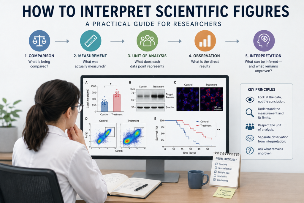
A scientific figure can look convincing before you understand what it actually shows.
One bar is taller. One band is darker. Two survival curves separate. A microscopy image appears brighter in the treatment group.
Those visual differences matter.
They are not the conclusion.
To interpret a figure well, reconstruct the experiment behind it:
Comparison
    ↓
Measurement
    ↓
Direct observation
    ↓
Supported interpretation
    ↓
What remains unproven
The central question is not:
Does this figure look convincing?
It is:
Do the experimental design, measurement, controls, and analysis support the stated claim?
Contents
- A Two-Minute Figure Reading Workflow
- Why Scientific Figures Are Easy to Misread
- Start With the Experimental Comparison
- Identify the Unit of Analysis
- Read the Axes, Scale, and Normalization
- Separate Observation From Interpretation
- How to Read Multi-Panel Figures
- Questions for Common Figure Types
- How AI Can Help—and Where It Fails
- A Compact Figure-Reading Checklist
The Quick Answer
Before accepting the conclusion of any scientific figure, ask five questions.
The Five-Question Figure Read
- What is being compared?
- What was actually measured?
- What is the independent unit?
- What is the direct result?
- What remains an interpretation?
| Question | What to identify | Common mistake |
|---|---|---|
| What is compared? | Groups, conditions, doses, or time points | Comparing groups that differ in more than one important way |
| What is measured? | Assay and biological endpoint | Treating the assay as the entire biological process |
| What is the unit? | Patient, animal, culture, image, or measurement | Treating technical replicates as independent samples |
| What is observed? | Direction, magnitude, distribution, and uncertainty | Looking only at the p-value |
| What is inferred? | Biological explanation or mechanism | Treating interpretation as direct evidence |
Do not begin with the authors’ conclusion.
Begin with the comparison and the measurement.
The five questions tell you what to look for.
The two-minute workflow below shows you what to do when a figure first appears in front of you.
A Two-Minute Figure Reading Workflow
When you first encounter a figure, do not try to understand every detail at once.
Move through five practical actions.
Step 1: Write the Comparison in One Sentence
Complete this sentence:
The figure compares ______ with ______ under ______ conditions.
For example:
The figure compares stimulated wild-type macrophages with stimulated knockout macrophages.
This forces you to identify the experimental variable before interpreting the graph.
If you cannot state the comparison clearly, pause and read the figure legend.
Step 2: Name the Assay and Endpoint
Ask:
What did the assay directly measure?
Do not replace the measurement with a broader biological label.
For example:
- qPCR measures transcript abundance;
- Western blot measures detected protein abundance;
- ELISA measures analyte concentration in the tested sample;
- flow cytometry measures signals within a defined gated population;
- survival analysis measures time-to-event outcomes.
“Inflammation,” “cell activation,” and “disease progression” are interpretations.
They are not assays.
Step 3: Identify What One Data Point Represents
Ask what each dot, bar, image, or event represents.
Is it:
- one patient;
- one animal;
- one independently prepared culture;
- one tissue sample;
- one image;
- one well;
- one repeated measurement?
Ten images from two animals do not equal ten independent animals.
Step 4: Describe Only the Direct Result
Use neutral language.
For example:
Secreted IL-1β was higher in knockout macrophages than in wild-type macrophages after stimulation.
Do not add a mechanism yet.
Avoid jumping immediately to:
Protein X controls inflammation.
The first sentence describes the result.
The second makes a broader biological claim.
Step 5: List What the Figure Still Cannot Prove
Ask:
- What alternative explanations remain?
- What additional experiment would distinguish them?
- Does the figure support a mechanism or only a pattern?
Quick rule: Read the comparison and measurement before reading the biological claim.
For many figures, these five steps are enough to decide whether a deeper read is necessary.
You do not need to memorize every statistical method or assay. If you can consistently identify the comparison, the measurement, the unit of analysis, and the difference between observation and interpretation, you will already read most scientific figures more critically than many readers.
Why Scientific Figures Are Easy to Misread
Visual Patterns Feel More Direct Than They Are
Figures are designed to communicate patterns quickly.
That is useful, but it can also create false confidence.
A taller bar may look biologically important even when the absolute difference is small. A bright microscopy image may appear dramatic even when acquisition settings differ. A dark Western blot band may look stronger even when the signal is saturated.
The visual pattern is only one layer of the evidence.
Its meaning depends on how the data were collected, processed, normalized, and analyzed.
Important Information Is Scattered
A figure rarely contains everything needed for interpretation.
You may need information from:
- the figure legend;
- the Methods;
- the Results;
- supplementary figures;
- statistical notes.
A graph may show ten dots per group.
Only the Methods may reveal that those dots represent ten images collected from two animals rather than ten independent biological samples.
The picture and the experimental unit are not always the same thing.
Figure Titles May Already Contain Interpretation
Compare:
Secreted IL-1β in wild-type and knockout macrophages
with:
Protein X suppresses inflammatory cytokine production
The first describes a measurement.
The second presents a biological interpretation.
The title may be reasonable, but it can guide the reader toward a conclusion before the data have been examined.
A useful habit is to ignore the title temporarily and describe the figure in neutral language first.
Start With the Experimental Comparison
Every figure begins with a comparison.
Common examples include:
- treated versus untreated;
- wild type versus knockout;
- patient versus control;
- before versus after treatment;
- low dose versus high dose;
- early versus late time point.
Write the comparison in one sentence.
This sounds simple, but it prevents a common error: reading the graph before understanding what changed between the groups.
Are the Groups Actually Comparable?
Two labels do not guarantee a valid comparison.
Check whether the groups also differ in:
- age;
- sex;
- baseline condition;
- sample preparation;
- treatment duration;
- cell density;
- batch;
- imaging settings;
- exclusion criteria.
Imagine a microscopy figure in which the treatment group appears to contain fewer cells.
That could reflect the intended biological effect.
It could also reflect a lower starting cell density, greater cell loss during preparation, or different image-selection criteria.
The figure alone may not distinguish these possibilities.
Find the Control
Controls help separate the intended explanation from plausible alternatives.
Depending on the experiment, relevant controls may include:
- untreated controls;
- vehicle controls;
- negative controls;
- positive controls;
- wild-type controls;
- rescue conditions;
- loading controls;
- isotype controls;
- fluorescence-minus-one controls.
Quick rule: A control is not a decorative reference group. It defines which alternative explanation the experiment can exclude.
A large effect does not compensate for the absence of the control required to interpret it.
What Was Actually Measured?
The Figure Title Is Not the Assay
Figure titles often use broad biological language.
The assay usually measures only one part of that biology.
| Broad claim | Possible measurements |
|---|---|
| Inflammation | Cytokine mRNA, secreted protein, immune-cell infiltration, or histological score |
| Cell death | Membrane damage, caspase activity, metabolic activity, or morphology |
| Protein activation | Phosphorylation, localization, abundance, or enzymatic activity |
| Tumour growth | Volume, mass, imaging signal, or survival |
| Immune activation | Surface markers, cytokine secretion, proliferation, or cytotoxicity |
These measurements may be related.
They are not interchangeable.
A reduction in metabolic activity, for example, may reflect cell death, slower proliferation, metabolic suppression, or assay interference.
The assay result must be interpreted within its technical and biological limits.
Direct and Indirect Endpoints
Suppose a paper claims that a treatment increases cell migration.
A direct experiment might track cell movement over time.
An indirect experiment might measure a protein associated with migration.
The indirect result may support the claim.
It does not directly measure migration.
Ask:
- Was the process measured directly?
- Was a proxy used?
- What assumptions connect the proxy to the claim?
Keep Biological Levels Separate
For one gene or pathway, a study may measure:
- mRNA abundance;
- intracellular protein;
- protein modification;
- secretion;
- enzymatic activity;
- downstream cellular function.
A change at one level does not guarantee the same change at another.
mRNA may increase without a corresponding rise in protein.
Intracellular protein may remain stable while secretion increases.
Protein abundance may change without a change in activity.
Key point: The assay defines the claim.
Identify the Unit of Analysis
The number of visible data points can be reassuring.
It can also be misleading.
A dot may represent:
- one patient;
- one animal;
- one independently prepared culture;
- one tissue sample;
- one image;
- one field of view;
- one well;
- one repeated measurement.
Ten dots from ten patients are not equivalent to ten dots from ten images of one patient sample.
Biological and Technical Replicates
| Replicate type | Example | What it captures |
|---|---|---|
| Biological replicate | Different animals, patients, or independently prepared cultures | Biological variability |
| Technical replicate | Repeated wells or measurements from the same sample | Measurement variability |
Technical replicates help show whether an assay is consistent.
They do not automatically increase the number of independent biological samples.
A Common Independence Trap
Imagine that three animals were used.
Five microscopic fields were collected from each animal, producing fifteen measurements.
If all fifteen fields are treated as independent samples, the apparent sample size becomes larger than the actual number of independent biological units.
The fields are nested within animals.
The design and statistical analysis should account for that structure.
Quick rule: Count the units independently assigned to the experimental condition—not simply the number of dots, cells, wells, or images.
Read the Axes, Scale, and Normalization
A figure can be visually accurate while still creating a misleading impression.
Before comparing groups, inspect:
- axis titles;
- units;
- scale type;
- baseline;
- category order;
- time intervals;
- missing ranges.
Should the Y-Axis Always Start at Zero?
There is no universal rule.
For bar charts, a non-zero baseline deserves particular caution because bar length represents magnitude. A truncated axis can make a small difference appear dramatic.
For line graphs and scatter plots, a restricted range may reveal meaningful variation that would otherwise be difficult to see.
Ask:
- Is the truncation visible?
- Is the range scientifically justified?
- Does the visual impression match the numerical difference?
- Would the conclusion look different on the full scale?
Understand the Denominator
Normalization expresses one value relative to another.
Common examples include:
- fold change relative to control;
- protein abundance relative to a loading control;
- gene expression relative to a reference gene;
- fluorescence relative to baseline;
- signal relative to tissue area or cell number.
Suppose fluorescence is normalized to cell number.
That may be appropriate if the goal is signal per cell.
But it can hide a biologically important reduction in total cell number.
Normalization answers one question while sometimes obscuring another.
Ask:
- What was used as the reference?
- Is the denominator stable?
- Was the same reference used across groups?
- Are raw values available?
- Could normalization create or hide a difference?
Heatmaps and Transformed Data
A heatmap may display:
- raw abundance;
- log-transformed abundance;
- normalized expression;
- z-scores;
- row-scaled values.
In a row-scaled heatmap, red may mean “high relative to other values in this row.”
It does not necessarily mean “high in absolute terms.”
Two red cells in different rows may represent very different values.
Error Bars, Sample Size, and Statistical Significance
What Do the Error Bars Represent?
Error bars may show:
- standard deviation;
- standard error;
- confidence intervals;
- another measure of variability or uncertainty.
These quantities are not interchangeable.
The legend should define them.
Never assume.
Statistical Significance Is Not Effect Size
A small p-value does not establish:
- a large effect;
- biological importance;
- causality;
- reproducibility;
- mechanism;
- clinical relevance.
Imagine a very large study in which two groups differ by only 1%.
That difference may be statistically significant.
It may still be biologically trivial.
The reverse can also occur: a potentially meaningful effect may remain uncertain because the experiment is small or highly variable.
Interpret the p-value alongside:
- effect magnitude;
- uncertainty;
- sample size;
- data distribution;
- study design;
- biological context.
Look at the Distribution
Whenever possible, inspect individual data points.
Ask:
- Do the groups overlap?
- Are there outliers?
- Is one point driving the result?
- Are the data clustered?
- Is the sample size small?
- Is the distribution skewed?
A bar and error bar can hide these features.
Does the Statistical Test Match the Design?
Important distinctions include:
- paired versus independent observations;
- single versus repeated measurements;
- independent versus nested data;
- one comparison versus multiple comparisons;
- continuous versus time-to-event outcomes.
You do not need to reproduce the entire statistical analysis to notice an obvious mismatch.
Separate Observation From Interpretation
This is where many figures become more convincing than the evidence allows.
Write the result first.
Interpret it second.
Direct Observation
Secreted IL-1β was higher in knockout macrophages than in wild-type macrophages after stimulation.
This describes the comparison and endpoint.
Supported Interpretation
Protein X may suppress IL-1β secretion under the tested condition.
This is a biological interpretation.
It may be supported, but it is not identical to the measurement.
What Remains Unproven?
Higher extracellular IL-1β could result from:
- increased transcription;
- altered translation;
- enhanced processing;
- increased secretion;
- altered degradation;
- increased cell death;
- different viable cell numbers;
- assay interference.
One measurement rarely distinguishes all of these possibilities.
Use this sequence:
Measurement
    ↓
Direct result
    ↓
Supported interpretation
    ↓
Possible mechanism
    ↓
Additional experiment needed
Key point: The further a statement moves from measurement toward mechanism, the more evidence it requires.
How to Read Multi-Panel Figures
A multi-panel figure is usually built around one larger claim.
Ask:
What argument is this figure trying to build?
The panels may:
- validate the model;
- establish a phenotype;
- test a mechanism;
- confirm specificity;
- perform a rescue;
- extend the finding to another system.
Not every panel carries the same evidential weight.
One may confirm that a knockout worked.
Another may show the main phenotype.
A third may test whether the phenotype can be rescued.
Try to describe the role of each panel in one short phrase:
Panel A validates the model.
Panel B shows the phenotype.
Panel C tests whether the phenotype is reversible.
Then reconstruct the argument:
Figure question
      ↓
Panel-level comparison
      ↓
Direct result
      ↓
Connection to the next panel
      ↓
Overall conclusion
      ↓
Missing evidence
A sequence of related panels can strengthen an argument.
It does not automatically prove a mechanism.
Worked Example 1: Three Measurements of IL-1β
Consider a hypothetical figure comparing wild-type and knockout macrophages.
All three panels refer to IL-1β.
They do not measure the same biological level.
Panel A — IL-1β mRNA
Measured by qPCR.
WT   ███
KO   ███████
Direct result:
IL-1β transcript abundance is higher in knockout macrophages.
This shows a difference at the RNA level.
It does not show how much intracellular or secreted protein is present.
Panel B — Intracellular Pro–IL-1β
Measured by Western blot.
WT   █████
KO   █████
Direct result:
Intracellular pro–IL-1β abundance appears similar between groups.
This is not necessarily inconsistent with the qPCR result.
Transcript and protein abundance can differ because of timing, translation, degradation, or assay sensitivity.
Panel C — Secreted IL-1β
Measured by ELISA.
WT   ██
KO   ███████
Direct result:
Secreted IL-1β is higher in knockout macrophages.
This panel most directly supports a difference in extracellular cytokine abundance.
Combined Interpretation
Together, the panels show:
- higher IL-1β mRNA;
- little apparent difference in intracellular precursor protein;
- higher secreted IL-1β.
This pattern may indicate regulation at more than one biological level.
Possible explanations include:
- increased transcription followed by rapid processing;
- altered precursor conversion;
- enhanced release;
- differences in protein turnover;
- increased membrane damage or cell death.
The figure does not identify which mechanism is responsible.
Additional experiments would be needed to examine:
- mature IL-1β processing;
- cell viability;
- active secretion versus passive release;
- pathway dependence;
- rescue of the phenotype.
This is the difference between reading a figure and repeating its title.
Worked Example 2: A Brighter Microscopy Image
Imagine two fluorescence microscopy panels.
The treatment group appears much brighter than the control.
At first glance, the conclusion seems obvious:
The treatment increased Protein Y expression.
But brightness alone does not establish that claim.
Start with the measurement.
The image shows detected fluorescence in selected fields.
It does not automatically reveal whether:
- exposure settings were identical;
- background subtraction was applied consistently;
- more cells were present in one field;
- the signal was quantified across biological replicates;
- the antibody was specific;
- the displayed fields were representative.
A neutral observation would be:
The displayed treatment field shows greater fluorescence intensity than the displayed control field.
A supported interpretation may be:
Protein Y-associated fluorescence may be higher after treatment under the imaging conditions used.
A stronger conclusion such as:
Treatment induces Protein Y expression
requires consistent acquisition, appropriate controls, representative sampling, and quantitative support.
One bright image can illustrate a pattern.
It cannot establish how consistently that pattern occurred across the experiment.
Worked Example 3: A Larger Flow Cytometry Population
Imagine that a treatment group shows a larger CD11b⁺F4/80⁺ population than the control group.
At first glance, the conclusion may appear simple:
The treatment increased macrophage numbers.
But a final gated population depends on several earlier decisions:
- debris exclusion;
- singlet selection;
- viability gating;
- compensation;
- threshold placement;
- selection of control samples;
- whether percentages or absolute counts were reported.
A neutral observation would be:
A higher percentage of recorded events fell within the CD11b⁺F4/80⁺ gate in the treatment group.
That does not yet prove that the total number of macrophages increased.
The percentage may change because:
- the macrophage population increased;
- another population decreased;
- viability differed between groups;
- total recovered cell numbers differed;
- marker intensity shifted;
- gating thresholds were applied differently.
For example, imagine that macrophages represent 20% of 1 million recovered cells in the control group and 30% of 500,000 cells in the treatment group.
The percentage is higher after treatment.
The absolute macrophage count is lower.
A stronger conclusion requires:
- consistent gating;
- appropriate fluorescence controls;
- comparable sample processing;
- biological replication;
- total cell recovery data;
- preferably absolute cell counts.
Key point: A larger percentage inside a gate is not automatically a larger number of cells.
Questions for Common Figure Types
| Figure type | Ask first | Common risk |
|---|---|---|
| Bar or dot plot | What does each point represent? | Distribution or sample size may be hidden |
| Scatter plot | Are the variables related, and is the relationship causal? | Correlation may be overinterpreted |
| Line graph | Are intervals, baselines, and uncertainty clear? | Unequal intervals or missing variability |
| Heatmap | What transformation and scaling were used? | Colour may hide absolute magnitude |
| Western blot | Are loading, exposure, band identity, and quantification credible? | Darker bands may be overinterpreted |
| Microscopy | Were acquisition, field selection, and quantification controlled? | A representative image may not represent the dataset |
| Flow cytometry | How were populations gated and reported? | Percentages may be confused with absolute counts |
| Kaplan–Meier curve | How many subjects remain at risk over time? | Late curve separation may be unstable |
The figure type should guide your questions.
It should not replace the five-question framework.
Western Blots
A darker band is not automatically evidence of more protein.
Apparent intensity may be affected by:
- unequal loading;
- saturation;
- uneven transfer;
- background;
- nonspecific binding;
- image processing.
Before interpreting the result, look for:
- expected molecular weight;
- target specificity;
- loading control;
- exposure range;
- transfer quality;
- full-blot availability;
- quantification;
- biological replication.
A loading control supports normalization.
It does not prove target specificity or linear exposure.
Quick rule: A darker band is interpretable only when loading is comparable, exposure is within range, and band identity is credible.
Cropping may be acceptable when it is transparent, scientifically justified, and supported by full-image availability.
Selective or undisclosed cropping may be misleading.
Microscopy Images
Microscopy can show location, morphology, and spatial relationships.
It cannot show how representative the displayed field is.
That depends on:
- acquisition settings;
- scale and magnification;
- background correction;
- thresholding;
- segmentation;
- field selection;
- biological sample number;
- quantitative analysis.
A useful question is:
Was the field selected because it represents the dataset, or because it displays the phenotype clearly?
The image shows what was visible in one field.
The quantitative analysis should show whether the pattern extends to the wider experiment.
Flow Cytometry, Heatmaps, and Survival Curves
Flow Cytometry
A final flow plot is the result of several analytical decisions.
These may include:
- debris exclusion;
- singlet selection;
- viability gating;
- compensation;
- marker thresholds;
- control selection.
A population can appear larger or smaller depending on how the gates were defined.
The final gate cannot be interpreted properly without knowing how the cells entered it.
Also distinguish between:
- percentage of a parent population;
- event count;
- absolute cell count;
- marker intensity.
These measurements answer different questions.
Heatmaps
Heatmaps are useful for identifying patterns.
They are less useful for judging exact magnitude unless the transformation and scale are clear.
Check:
- what the rows and columns represent;
- whether values were normalized or transformed;
- whether scaling occurred by row or column;
- how clustering was performed.
Two similarly coloured cells may not represent similar absolute values.
Kaplan–Meier Curves
A visible separation between curves does not automatically mean the difference is stable, precise, or clinically important.
Check:
- number at risk;
- censoring;
- follow-up duration;
- confidence intervals;
- effect estimates;
- statistical comparison.
The tail of the curve may be based on very few remaining participants.
A dramatic late separation may therefore be highly uncertain.
How AI Can Help—and Where It Fails
AI can make figure reading more systematic.
It can help:
- identify panel labels;
- turn a legend into a structured summary;
- compare predefined variables;
- separate observations from interpretations;
- organize notes across panels;
- generate questions for manual review.
The quality of the result depends heavily on the question.
Avoid Vague Prompts
A prompt such as:
Explain this figure.
gives the model too much freedom.
It may summarize the authors’ interpretation, overlook the experimental unit, or describe a mechanism that the figure does not directly test.
Use bounded prompts instead.
Prompt 1: Basic Figure Inspection
Using only the figure and legend, identify:
- the groups being compared;
- the measured variable;
- the unit of analysis, if reported;
- the direction of the result;
- information that remains unclear.
Do not propose a mechanism.
This is useful for an initial read.
It is not enough for a final interpretation if essential details appear only in the Methods.
Prompt 2: Observation Versus Interpretation
Separate the figure into three sections:
- Direct observation
- Supported interpretation
- Claims not established by this figure
Use neutral language and preserve the exact endpoint measured.
This helps prevent the figure title from becoming the conclusion automatically.
Prompt 3: Multi-Panel Figure Analysis
For each panel, identify:
- the comparison;
- the assay;
- the direct result;
- the role of the panel in the overall argument.
Then explain how the panels connect and list the evidence still required to support the proposed mechanism.
Prompt 4: Figure Verification
Using the figure, legend, relevant Methods, and Results text, identify the comparison, measured variable, independent unit, controls, normalization, statistical analysis, direct result, and supported conclusion. Write “Not reported” when information is missing.
This is the most useful format when accuracy matters.
Prompt 5: Flow Cytometry Review
Using the full gating sequence, figure legend, and relevant Methods, identify:
- the parent population for each gate;
- debris, singlet, and viability gates;
- compensation and fluorescence controls;
- the final marker-defined population;
- whether the result is reported as a percentage, count, or absolute cell number;
- any conclusion that cannot be supported from the final plot alone.
What AI May Still Miss
AI may misread:
- small labels;
- axes;
- colour legends;
- error bars;
- cropped panels;
- normalization;
- statistical annotations;
- relationships between panels;
- flow cytometry gating sequences.
A safer workflow is:
Inspect the figure yourself
        ↓
Read the legend and relevant Methods
        ↓
Ask one bounded question
        ↓
Compare the answer with the source
        ↓
Save only verified notes
AI is useful when it makes inspection more systematic.
It should not replace the inspection.
A Compact Figure-Reading Checklist
Before accepting a figure-level claim, confirm:
Design
- What question is being tested?
- Which groups are compared?
- Is the control appropriate?
Measurement
- What was directly measured?
- Is the endpoint direct or indirect?
- What units and normalization were used?
Data Structure
- What does each point represent?
- How many independent biological samples are present?
- Are technical and biological replicates separated?
Analysis
- What do the error bars show?
- Does the statistical test match the design?
- Are effect size, distribution, and uncertainty visible?
Interpretation
- What is directly observed?
- What conclusion is supported?
- What remains unproven?
- What experiment would distinguish the alternatives?
Frequently Asked Questions
What Should I Look at First in a Scientific Figure?
Start with the comparison and measured variable. Identify the groups, assay, axes, and unit of analysis before reading the authors’ interpretation.
How Do I Interpret a Multi-Panel Figure?
Identify the overall question, then determine the role and direct result of each panel. Ask how the panels build the larger argument and what evidence is still missing.
What Is the Difference Between Biological and Technical Replicates?
Biological replicates are independent biological units, such as different animals or independently prepared cultures. Technical replicates are repeated measurements of the same material.
Does Statistical Significance Mean the Result Is Important?
No. Statistical significance does not establish effect size, biological importance, causality, reproducibility, or mechanism.
Should a Y-Axis Always Begin at Zero?
Not always. Bar charts require particular caution, while line and scatter plots may use restricted ranges to show meaningful variation. The scale should be clear and justified.
How Can I Tell Whether a Graph Is Misleading?
Look for truncated axes, inconsistent scales, hidden distributions, selective ranges, unclear normalization, missing units, and graph types that exaggerate apparent differences.
How Do I Interpret a Flow Cytometry Plot?
Examine the full gating sequence, controls, compensation, viability gate, parent population, and reporting method. A larger percentage inside a gate does not automatically mean a larger absolute cell count.
Can AI Interpret Scientific Figures?
AI can help organize the inspection and identify obvious labels or trends. It may still misread scales, legends, controls, normalization, gating, or statistical details, so conclusions should be checked manually.
Key Takeaways
Begin with the comparison, not the authors’ conclusion.
Identify what was actually measured and what each data point represents.
Read the legend, Methods, and statistical details together with the panel.
Separate direct observation from biological interpretation.
Ask what remains unproven before accepting the figure-level claim.
A figure does not prove what its title says. It presents a set of measurements. The reader’s job is to decide how far those measurements can support the claim.
Continue Learning
Scientific Reading and Interpretation
- How to Read Scientific Papers
- Western Blot Interpretation Guide
- Western Blot Troubleshooting Cheat Sheet
- How to Organize Research Papers
AI for Research
- ChatGPT for Research
- Claude Prompts for Scientific Research
- Claude vs ChatGPT for Research
- Best AI Tools for Researchers